Unistellar eVscope - More Experiences (V. 2 to 2.3)
Introduction | Overview of App Version 2 and some Remarks on it | Wishes Fulfilled... | Small Bug List | Suggestions for Improvement | First Conclusions on App Version 2 (up to Version 2.3) | Links
Archive
On this page, I will report on first experiences with the new app version 2 (using the eVscope 2), including versions 2.0 to 2.3, which in fact required me to get to know the newly designed app version 2. Note that app version 2.4 and newer are covered on a separate page Archive.
Notes: See page Overview of the Unistellar Pages for just that! For a detailed version history of version 2 of the app, see page Unistellar App Version History (Version 2) Archive.
Introduction
 |
 |
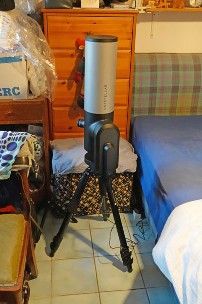 |
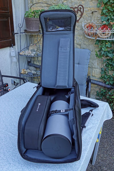
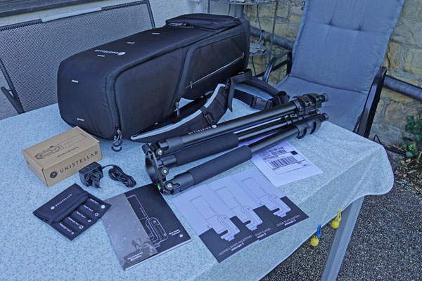
Photos: My third eVscope 2 (August 22, 2022)
Unistellar offers the following information about app version 2:
- The new Unistellar App is here !: help.unistellar.com/hc/en-us/articles/5224215379740-The-new-Unistellar-App-is-here-
- Video Short Tutorial on the App 2.0: youtu.be/onbz0sNADyk
I will therefore not offer any information as to the handling of the eVscope with app version 2.
Information regarding the version history of app version 2 can be found on page Unistellar App Version History (Version 2) Archive.
Overview of App Version 2 and some Remarks on it
Over time, I wanted to describe here what I noticed with respect to app version 2. I start with an overiew of early versions of app version 2 (up to version 2.3) and some remarks on it.
Version 2.0.1/2/3, Version 2.1, Version 2.2 - Overview and Remarks
I started already with App version 2.0.2 and used it for the first time on August 22, 2022 with my new third eVscope 2 ("First Light"), that is, shortly before the release of version 2.0.3. And since pretty much everything is different from the "retired" version 1, I first had to adjust and get used to the new processes. Im mid-September 2022, app version 2.1 was released, which more or less corrected errors. With this version, I used my eVscope 2 for the second and third time. And at the end of November, version 2.2 was already released, introducing the new planet mode, which I already tested briefly.
First of all, it is not easy for me to write something about the new app version in general, because on the one hand it is structured quite differently from the first version, and on the other hand I do not want to write a "novel" about all this. At first glance, the new app version looks more complex and somewhat more complicated than the old version. But such impressions are typical for the introduction of new software generations. In any case, I managed to get along with the new version and to make observations. That is good news already! Crashes also seem to have become less frequent, but the WLAN range still remains borderline (and worse than with the Vespera).
If you are used to the old terms and icons of app version 1, it is hard to get used to the new ones at first. I also do not know whether all the new terms are really an improvement... The following graphic gives a rough overview of the screens and navigation between them in app version 2 (subscreens like the "information overlays" are missing...):
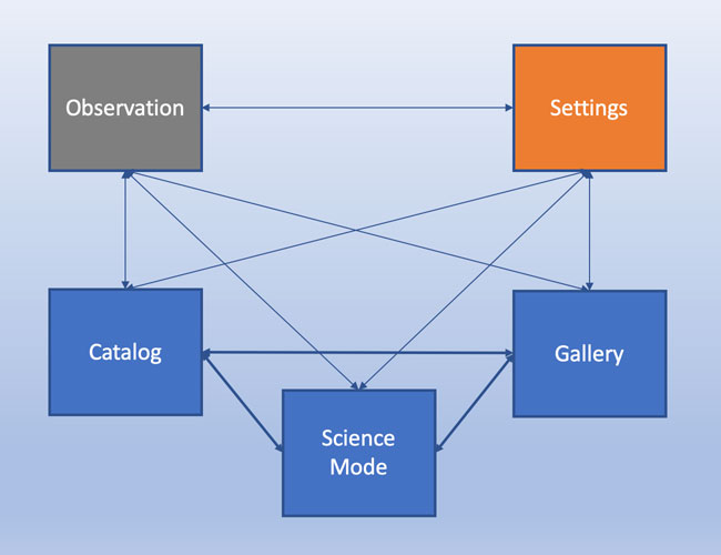
Figure: Navigation structure of the Unistellar App version 2
You can switch beween the "blue boxes" using icons at the bottom of the screen (like in app version 1). Specific icons at the right edge of the screen allow you to access the observation screen and the settings screen, the latter functions more like an "information overlay" and returns to the screen from which it was called. The latter is also true for the observation screen, but is handled differently.
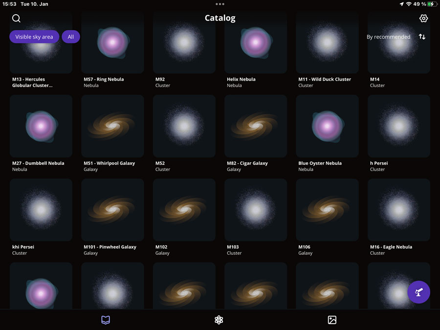
Catalog
After starting the app, you first get to the catalog, which displays a selection of objects (or all of them) and which you can filter according to your needs. The search can also be regarded as a filter, but it seems to work independently from the other filter options. From the catalog you can switch to scientific observations (center) and to the gallery (right) via icons at the bottom of the screen. Other icons lead to the settings (wheel, top right edge) and to the observation screen (eVscope, bottom right edge).
 |
 |
|
Catalog |
Ditto, with navigation and filter options (see text) |
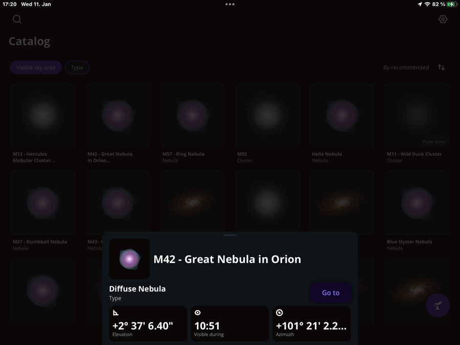
When you select an object, you can get information about it (as in the gallery, see also there), and can start a "Go to". You can also scroll the information overlay to see further information.
 |
 |
|
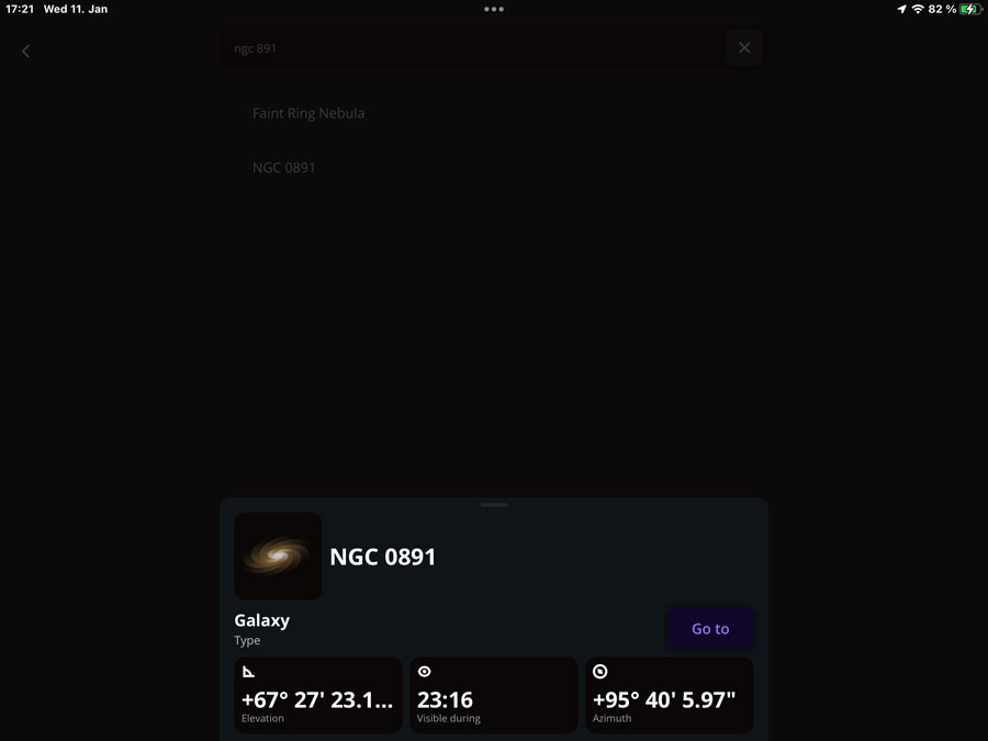
Catalog: M 42 selected, data and a "Go to" button displayed |
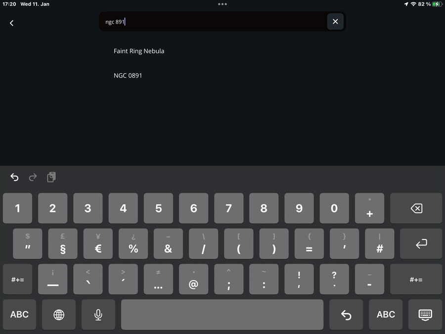
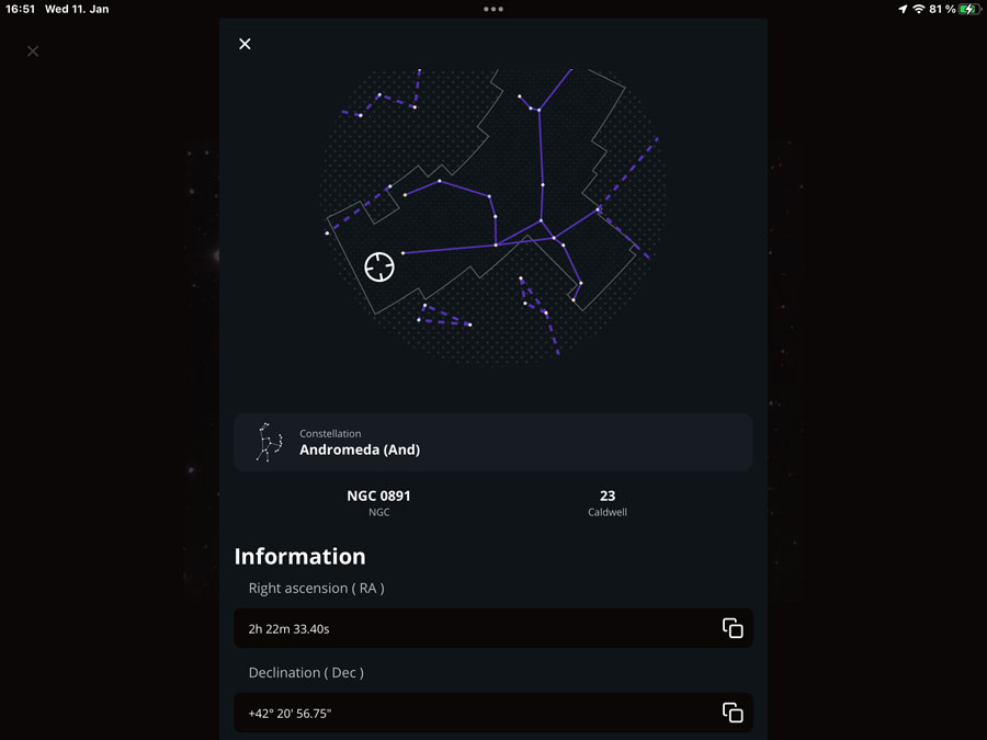
"NGC 891" entered into the search field, two objects found | |
 |
 |
|
NGC 891 selected, data and a "Go to" button are displayed |
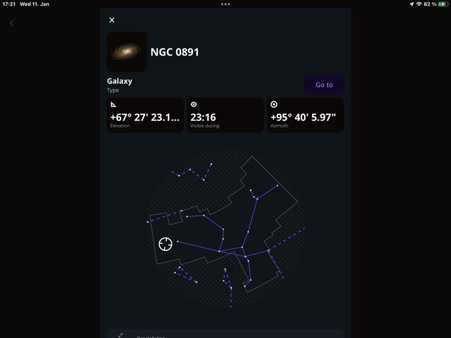
Information screen scrolled down; icon for closing the window appears |
|
 |
 |
|
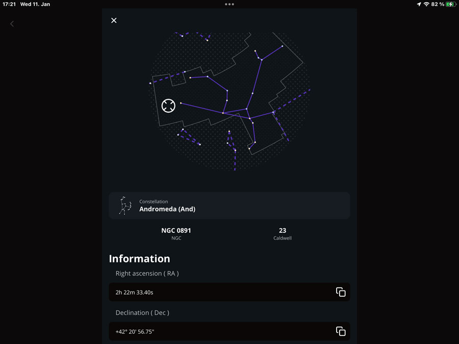
Information screen scrolled further down |
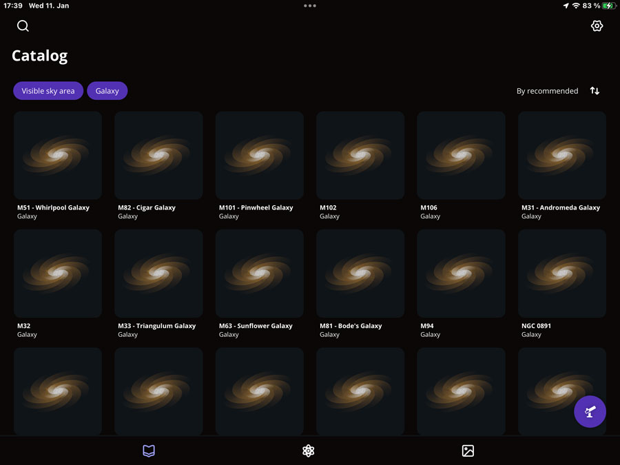
Catalog: Only galaxies selected - the images do not help much, but waste space... |
Schematic symbols are used for the different DSO types, which take up a lot of space and, in my eyes, do not bring any advantages if you select just one DSO type, such as galaxies (see figure above). If more than one DSO type is selected, the symbols help with the selection, but the graphics are too large. I suspect that Unistellar will replace the icons with photos or schematic photos over time (as Vaonis does). Only then would the display, as it currently is, make sense to me.
The search function in the catalog also takes some getting used to (as with Stellarmate...). If you enter "M", nothing happens, if you enter "M ", you get an endless list of M, but also IC and NGC objects and of objects, which have somewhere an "m" or "M" in their name. "M 1" returns as expected "M 1", "M 15" and "M 101" (only as examples), but also "M 31" and "M 51" later where there is searched in the names (the names include the catalog numbers). Apparently, it is enough if the "1" appears somewhere in the name or in the catalog number; the same applies to "M" or "m". However, in that case you can "clean up" the whole by entering more characters. "M 11" returns only "M 110" and "M 11 - Wild Duck Cluster", as does "M11"...
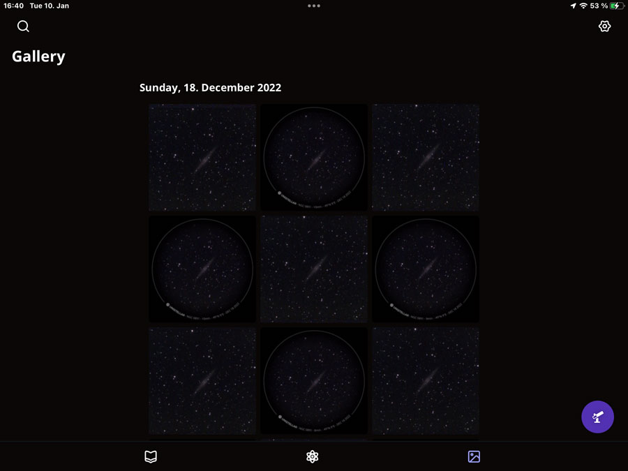
Gallery
The gallery provides access to the saved photos. You can select single objects and display detail data as well as share them; in addition, you can browse through the objects in single object view.
 |
 |
|
Gallery with several sky objects |
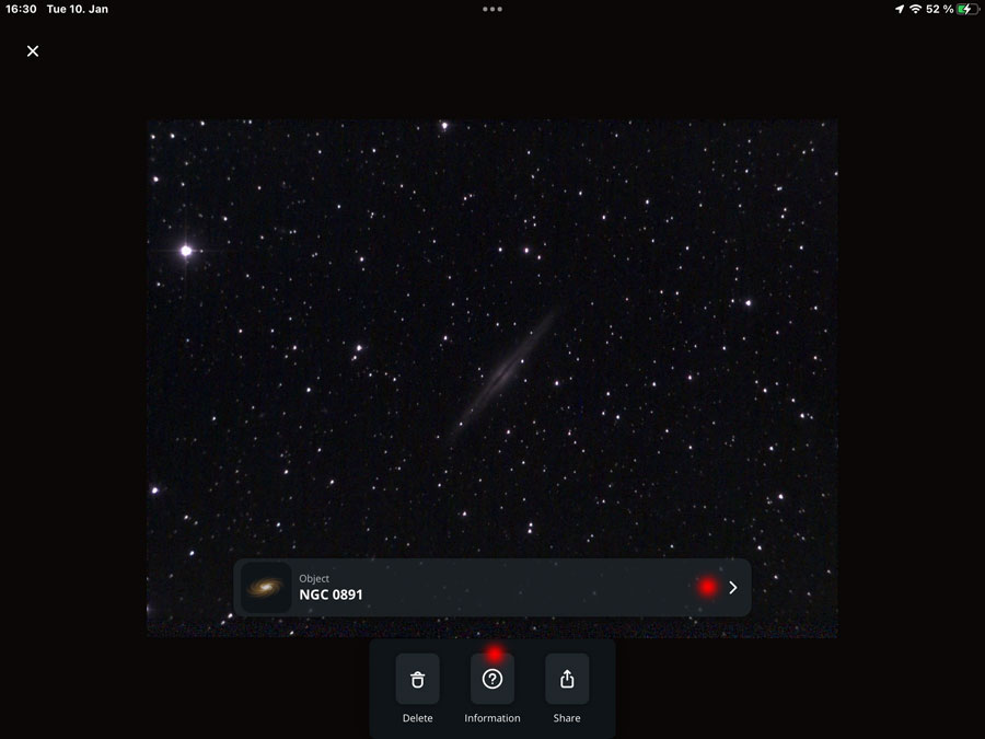
One sky object selected and displayed; at the bottom are buttons with options and to the right a ">" button |
Regrettably, I did not find a way to select multiple items in order to be able to delete or share them at once (as is possible in the Apple Photos app). Deleting and sharing photos is only possible in the single object view.
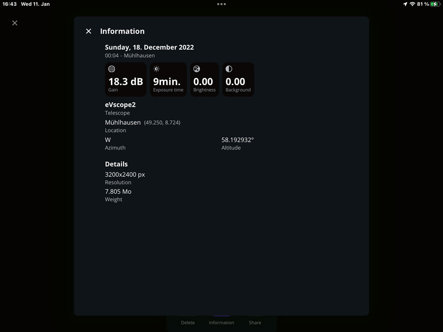
Single object view: Clicking the ">" buttons displays a longer screen with astronomical data about the selected object. Clicking the "Information" button ("?"), opens a screen with more technical data regarding the photo and camera settings, for example gain* and exposure time).
*) The automatic gain value always seems to be 18.3 dB. Once, I saw 46.2 dB on a faint object (at a very short exposure time) - this looks more like a "quirk"...
 |
 |
|
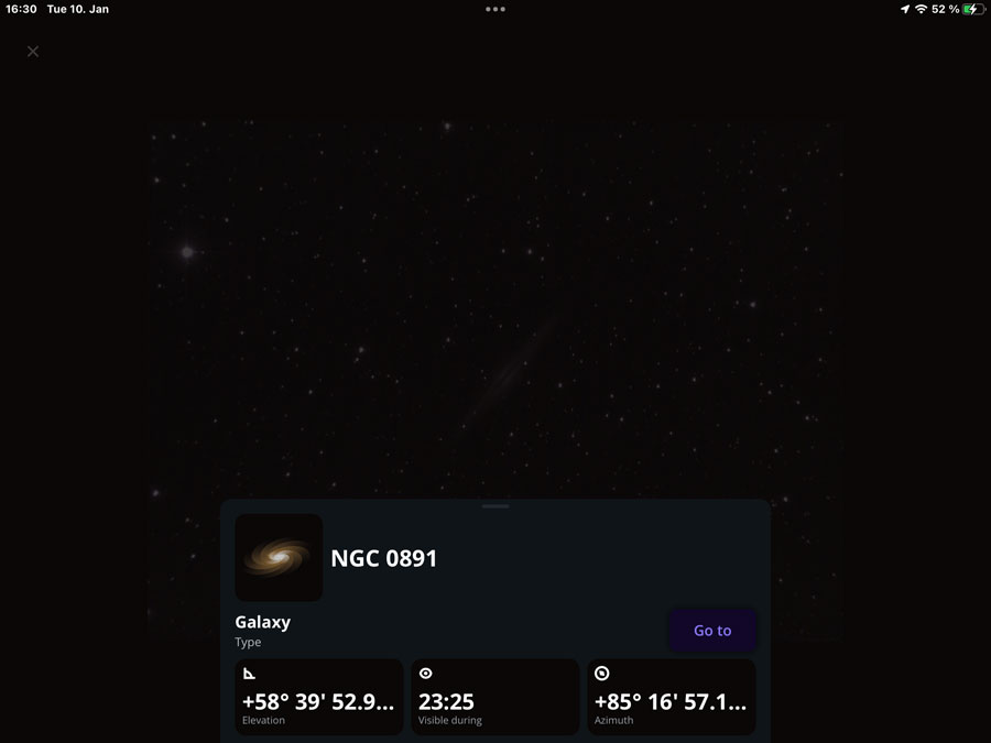
After clicking the "arrow right": Detail data for the selected sky object appear - plus a "Go to" button |
Ditto, scrolled down |
|
 |
 |
|
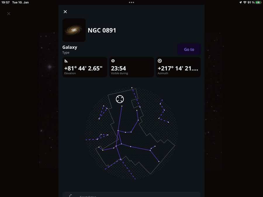
Ditto, scrolled further down |
This info screen appears after a click in the "Information" button |
In the German version, the file size is translated as "Gewicht" (English "Weight"). Hmmm... You can scroll the single views with your finger; I assume that this was probably already possible in app version 1.
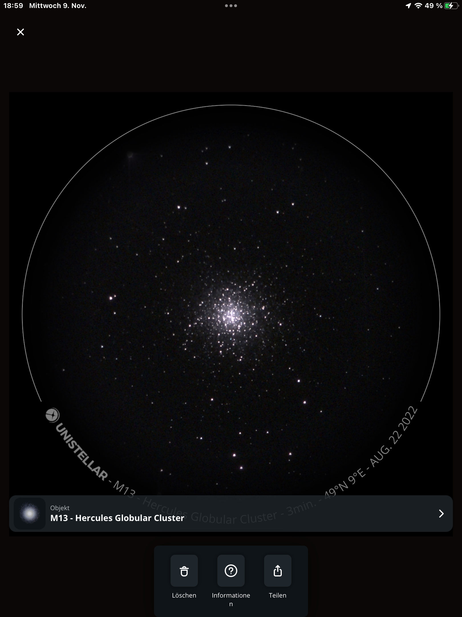
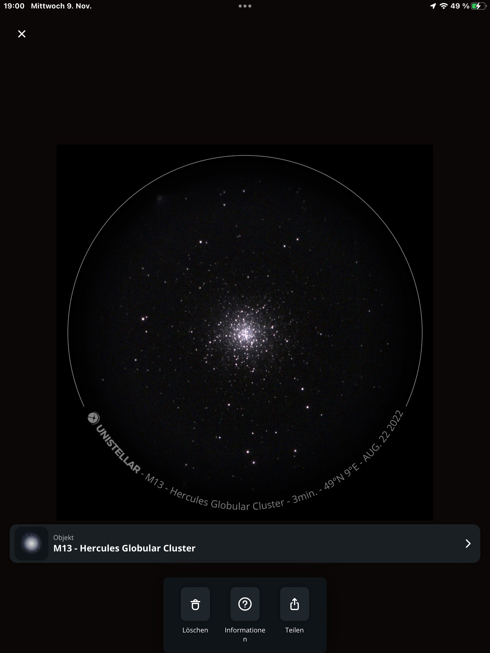
I noticed a small "blemish" in the gallery: When using the square image format with overlay, the caption with the name of the object covers parts of the overlay, including the exposure time. You can reduce the size of the image with a 2 finger gesture and then see everything (you could also call up the exposure time via the information button), but of course it would be nicer if nothing would be covered...
 |
 |
|
Photo in normal size |
Photo made smaller (minimum size) |
Scientific Observations
I do not write anything about this, because I do not intend to participate in scientific observations.
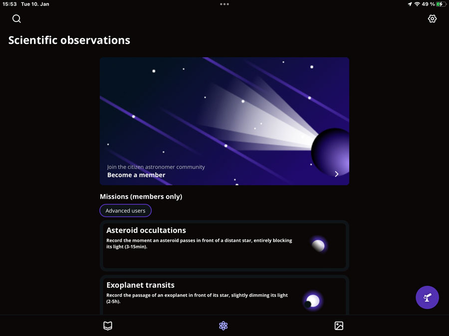
Figure: Entry screen for scientific observations
Observation Screen
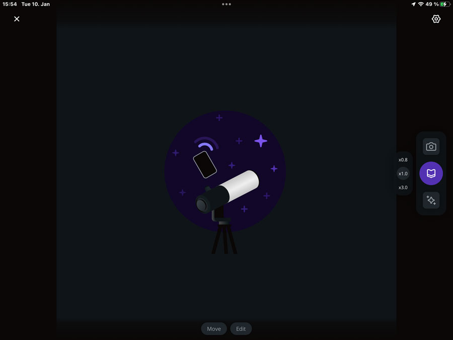
Figure: Observation screen
The observation screen is probably the screen where you spend the most and the longest time. It can be accessed from the catalog as well as from the gallery and the scientific observations via a round eVscope icon. At the bottom, there are icons to use the joystick (move) and enter positions manually. In the middle of the right edge are icons for taking photos, returning to the catalog (e.g., to change the target), and for starting/stopping "Enhanced Vision". In the upper right corner there is the icon for the settings.
In the center, the observed object is displayed (i.e. the camera image); it can be zoomed and moved. Moreover, it is possible to quickly choose between three preset image scales (0.8x, 1x, and 3x).
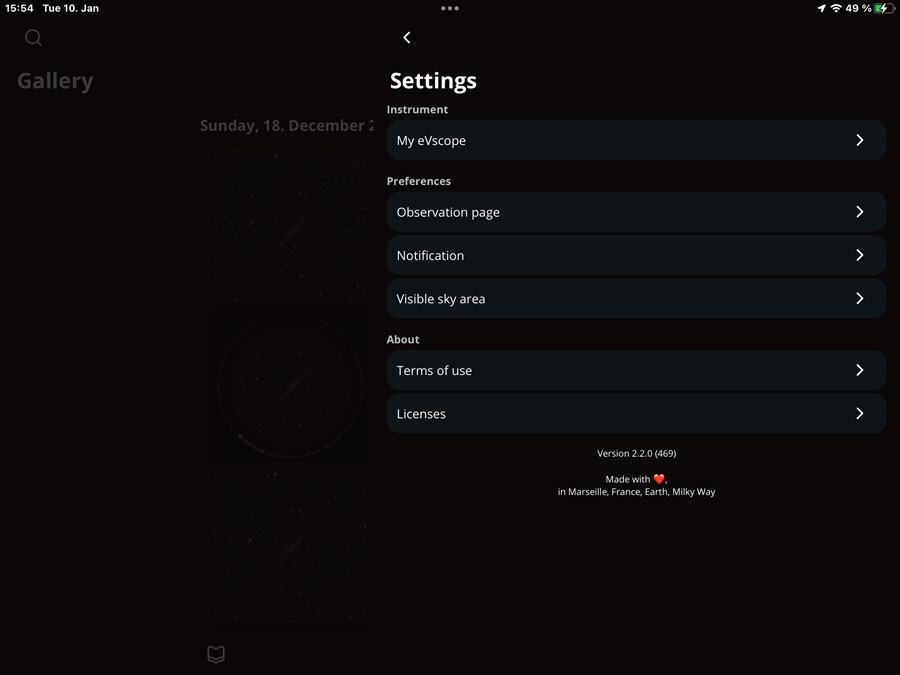
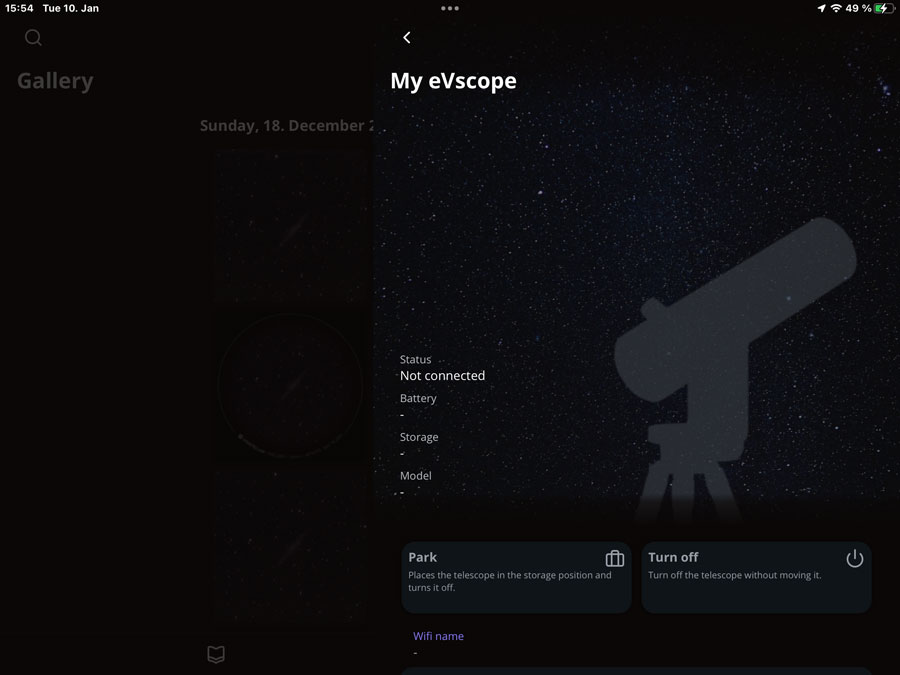
Settings Screen
On this screen, which can be accessed from most screens (but not from information overlays) via the "settings" icon and which works more like an "information overlay" (on my iPad it covers a little more than half of the screen), the new app version offers information and settings options for the eVscope. This certainly makes sense, although the "automatic alignment" ("orientation", formerly called "field detection") looks a bit strange to me on the "My eVscope" screen. But I saw in an Unistellar video that this feature is also offered on the observation screen once it makes sense.
 |
 |
|
Settings screen |
"My eVscope" subscreen |
The German translations of the texts are also a bit strange, the English ones fit better... My proposals*:
- Parken: OK
- Ausschalten: Schaltet das Teleskop aus, ohne es zu bewegen (the English version should be: Turns off the telescope without moving it).
- Sensorkalibrierung: Ist erforderlich für ein Bild von guter Qualität (Ist erforderlich, um ein Bild von guter Qualität zu erhalten)
- Okularschärfe: Zeigt ein künstliches Ziel an, damit die Okularschärfe leicht eingestellt werden kann.
*) The sentences should always use the same subject, either the user or the device. Typically, technical writers prefer to address the user directly...
On my iPad screen, screen space is wasted by the eVscope sketch, while it fits my iPhone screen quite well, because the eVscope sketch is much smaller there.
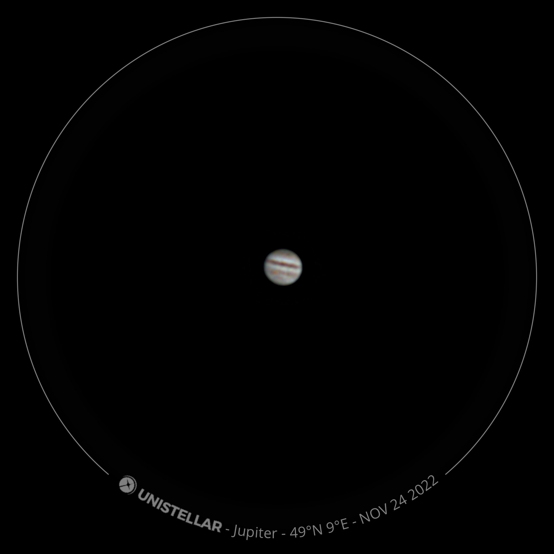
Planet Mode
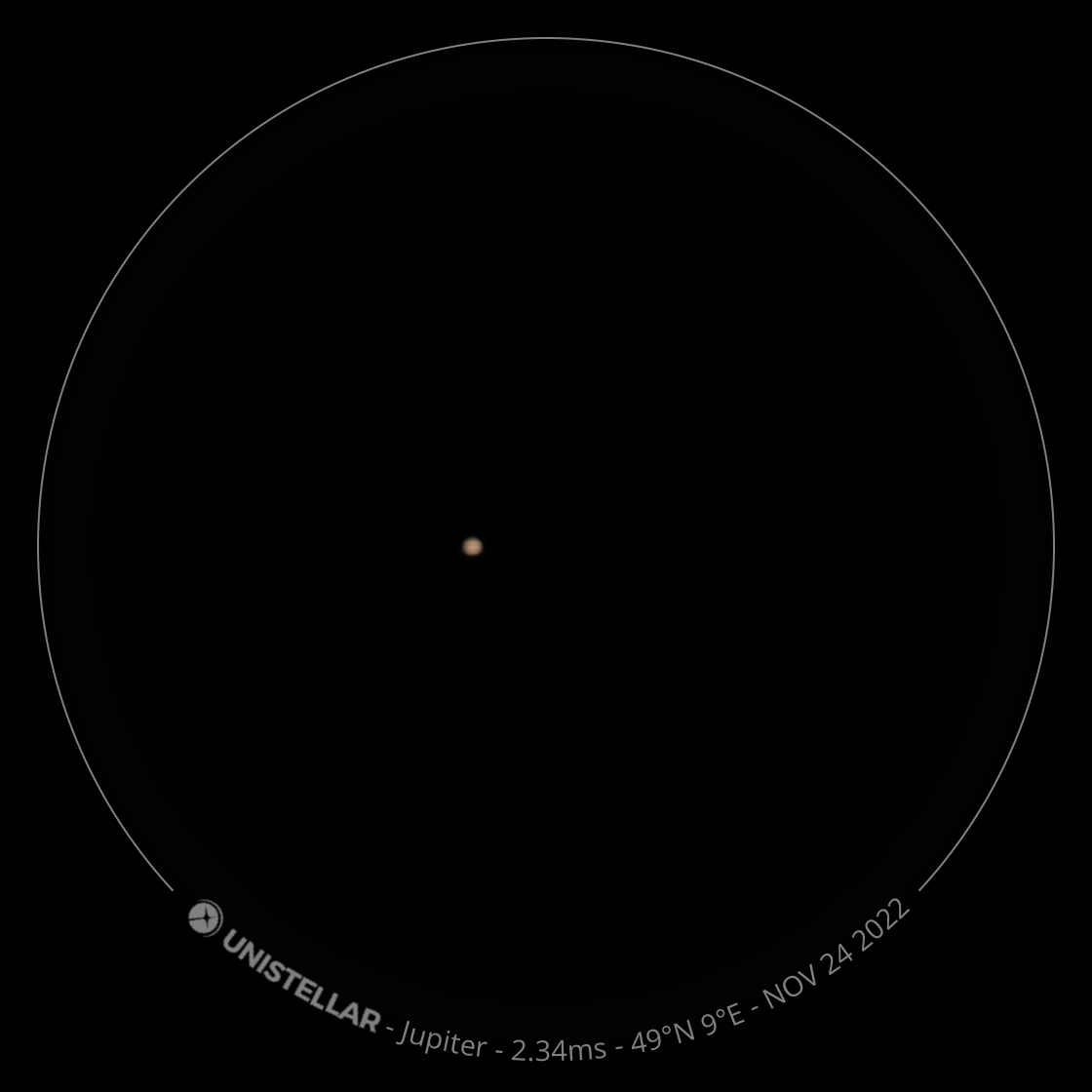
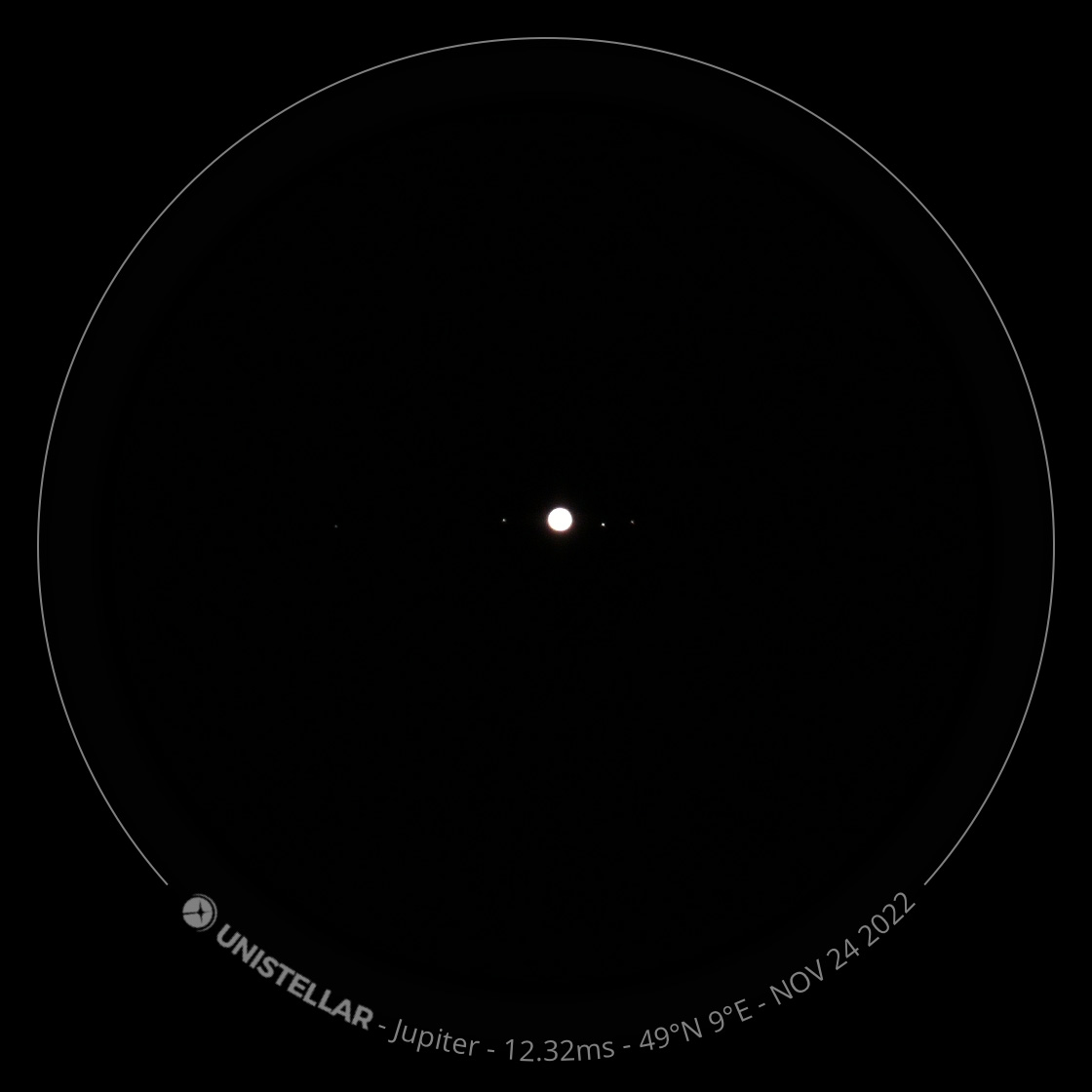
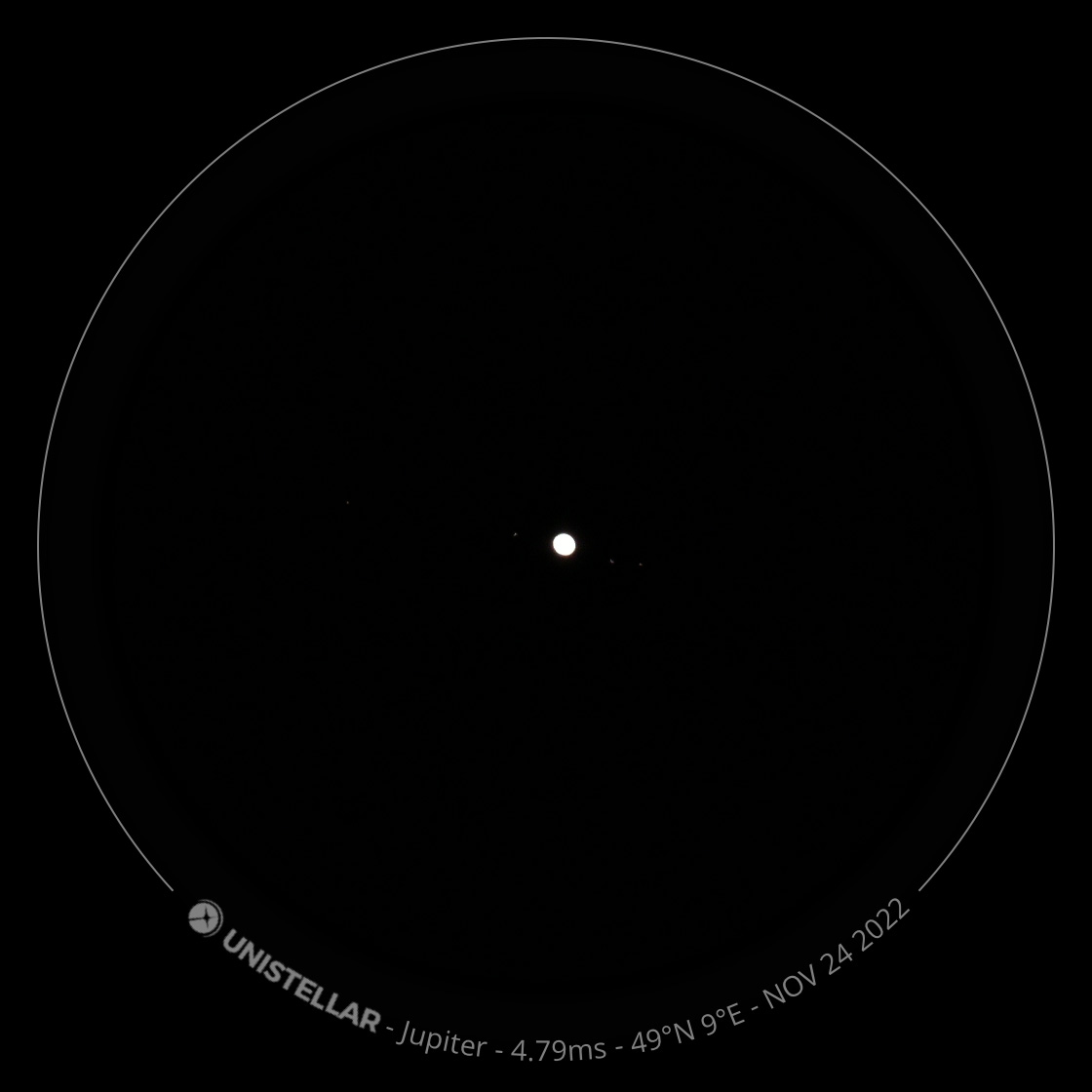
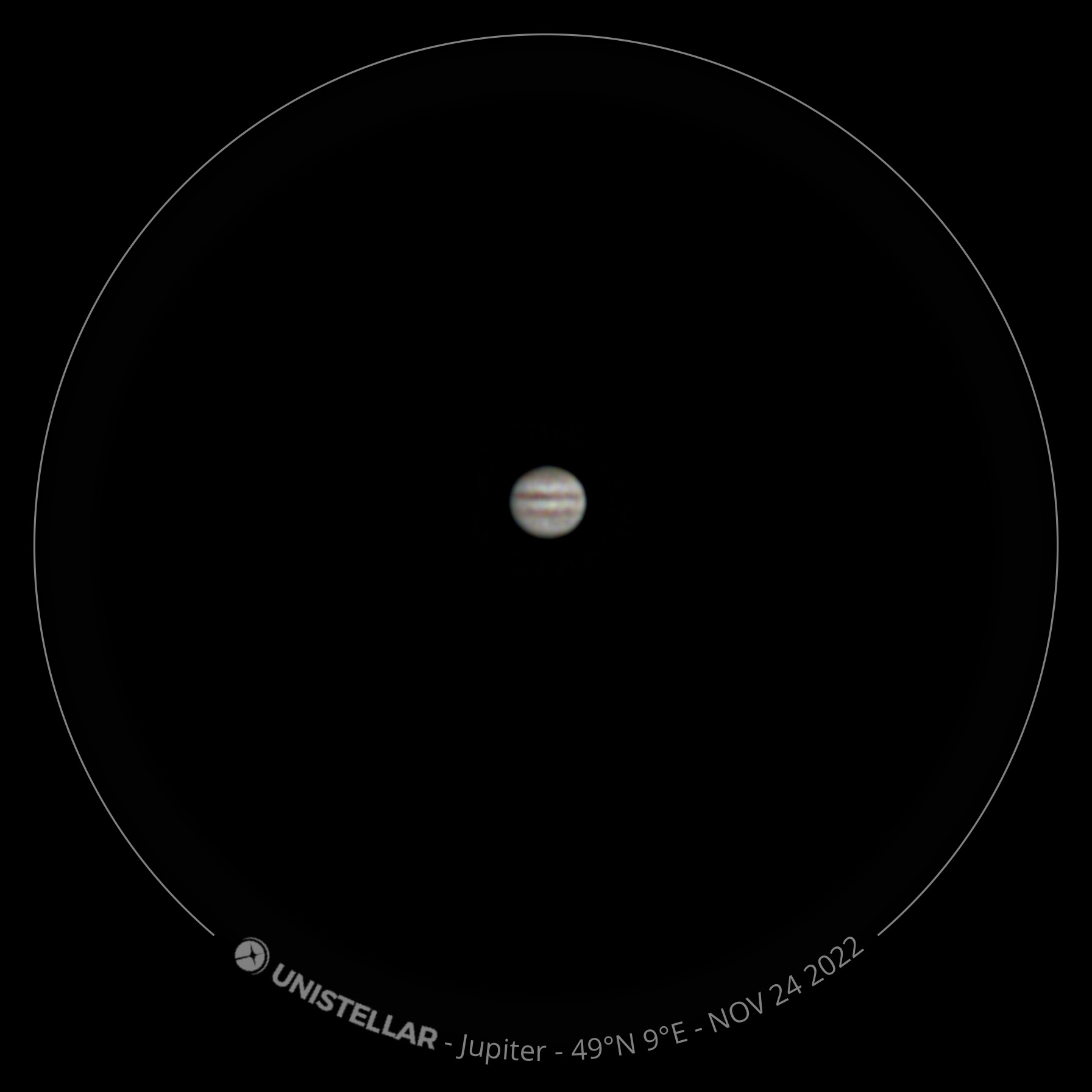
Version 2.2 introduced the new planet mode, which I discuss on page New Planet Mode for eVscope Telescopes. It also introduced another scientific mode, which I will not discuss here, because I do not participate in scientific observations. The following photos demonstrate the difference between observing planets in Live View mode and in Planetary mode (in Enhanced Vision mode):
 |
 |
 |
||
Jupiter in Live View mode with stripes |
Jupiter in Live View mode with moons |
Ditto with faint moons |
||
 |
 |
 |
||
Jupiter in planet mode |
Jupiter in planet mode with Great Red Spot |
Ditto |
The planets are magnified very highly in planet mode and are blurred accordingly. Perhaps, less would have been a bit more...
Wishes Fulfilled...
EXIF Data Now Display Observation Data
In early November 2022, when my eVscope 2 was back in use after a long break, I noticed, more or less by accident, that the photos now contain observation data in the EXIF data, which is something I had always wished and asked for (apparently already in version 2.0.2 and probably from version 2.0 or 2.0.1 on). After discovering that the app now saves the observation data into the EXIF data of the photos, my most important wish was to my delight fulfilled by Unistellar.
Small Bug List
During one of the first runs of the new version 2.0 the app crashed completely. But this did not happen again.
However, I found a first error, which sometimes occurs, but mostly not; so it is unpredictable: The app correctly navigates to a new GoTo target, but keeps the name of the previous target and also uses it in the overlay, that is, the label that overlays the image in a circle. This is somewhat annoying for me, because I only saved the image version with the overlay because of the label (for remembering the EV duration). But since I know that observation data are stored in the EXIF data, I no longer need to save both image versions...
Note: As I noticed, the wrong name is also stored in the EXIF data, both in the version with overlay and in the rectangular version without overlay.
Suggestions for Improvement
One wish that I have for the new app, already mentioned above, would be a multiple selection of photos in the gallery like in the Apple Photos app, in order to delete or share multiple photos at once.
First Conclusions on App Version 2 (up to Version 2.3)
The new app version requires some getting used to, including new terms for important concepts. Whether the app redesign leads to a simplified operation, I can not yet judge. In any case, I have been able to operate the new app version and make observations without any major problems.
Links
- Unistellar Website: unistellaroptics.com
- eVscope 2 product page: unistellaroptics.com/evscope2
- The new Unistellar App is here ! (Unistellar): help.unistellar.com/hc/en-us/articles/5224215379740-The-new-Unistellar-App-is-here-
- Video Short Tutorial on the App 2.0: youtu.be/onbz0sNADyk
- See also my page offering Astronomy Links.
|
made by |
| 18.02.2024 |